Layout is one of the most underrated decisions in video content design. The same set of videos can feel scattered and overwhelming in the wrong layout, or clean, engaging, and easy to browse in the right one.
MediaHaven Lite gives you three main gallery layout types — Grid, Carousel, and Multi-row Carousel — plus a Term grid/carousel system for category navigation. Each layout has deep customization options for columns, responsive breakpoints, card design, and display elements.
This guide walks through every layout in detail: what it’s for, when to use it, how to configure it, and what it looks like on your site.
The Three Core Layout Types
1. Grid Layout
The Grid layout is a classic responsive column system — videos arranged in rows and columns, uniform card sizes, scannable from top to bottom.
Best for:
- Video archive pages (all your tutorials, all your vlogs, etc.)
- Channel pages with a full video library
- Any gallery where you have 6+ videos and want users to browse at their own pace
- E-commerce product video galleries
- Blog-style video libraries with titles and descriptions visible
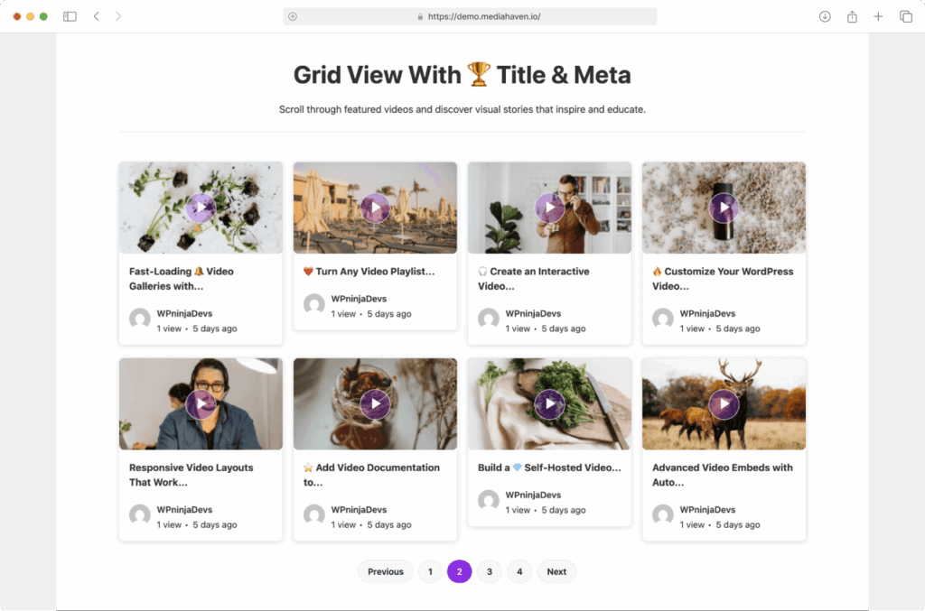
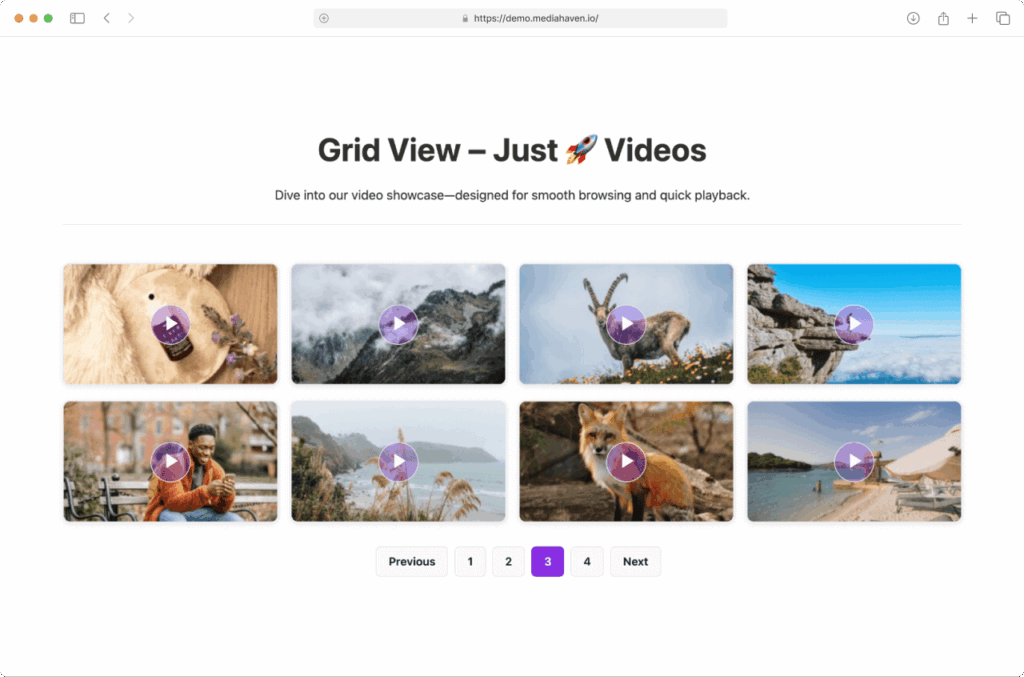
What it looks like: As shown in screenshot-1, the Grid layout displays video cards in equal-width columns. Each card contains the thumbnail (with a play button overlay on hover), and optionally the title, author, publish date, view count, and description excerpt.
screenshot-3 shows the ultra-clean grid variant — thumbnails only, no title or meta. This works beautifully for portfolio sites, visual showcases, and hero video sections where the visuals speak for themselves.
Grid configuration in MediaHaven:
Go to Views → Add New → Layout: Grid.
Column settings per breakpoint:
- XS (< 576px, small phones): typically 1
- SM (576px–767px, large phones): typically 1–2
- MD (768px–991px, tablets): typically 2
- LG (992px–1199px, laptops): typically 3
- XL (≥ 1200px, desktops): typically 3–4
Recommended column setups by use case:
| Use Case | XS | SM | MD | LG | XL |
|---|---|---|---|---|---|
| Blog-style video library | 1 | 1 | 2 | 3 | 3 |
| Portfolio / visual showcase | 1 | 2 | 2 | 3 | 4 |
| E-commerce product videos | 1 | 1 | 2 | 2 | 3 |
| Homepage featured section | 1 | 1 | 2 | 3 | 3 |
Pagination options for Grid:
- Numbered pagination — classic page 1, 2, 3 links below the grid. Good for SEO (each page gets its own indexable URL)
- Load More button — AJAX button that adds more video cards to the existing grid without a page reload. Better UX for most content sites.
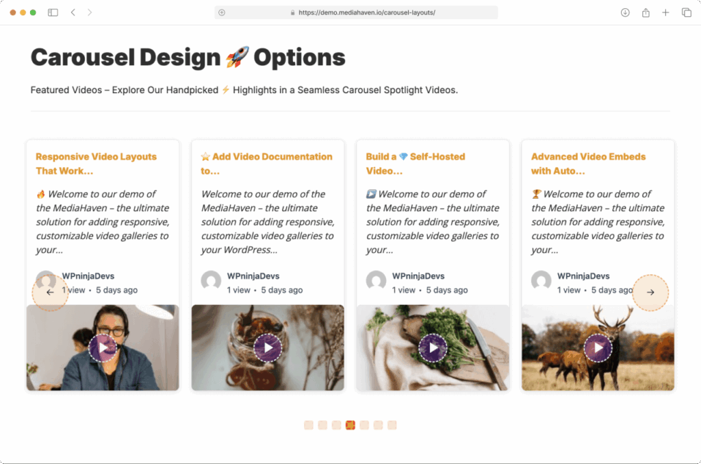
2. Carousel Layout
The Carousel layout is a horizontally scrolling slider. Users navigate left and right through videos using arrow buttons or touch/swipe on mobile. Only a subset of videos is visible at once.
Best for:
- Featured video sections on a homepage
- “Latest Videos” sections on a blog sidebar or between posts
- Short highlight reels (your top 5 videos, recent episodes, etc.)
- Anywhere you want high visual impact in limited vertical space
- YouTube playlist previews alongside written content
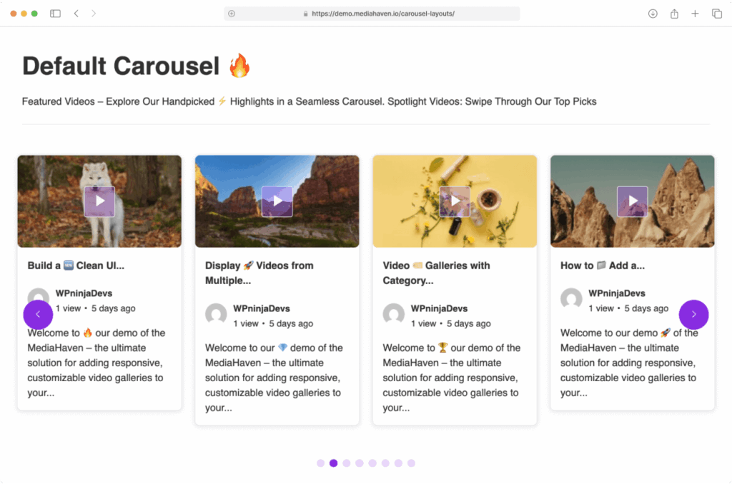
What it looks like: screenshot-6 shows the default carousel — video cards in a clean slider with navigation arrows on each side. Cards have the same structure as the Grid (thumbnail + title + meta, toggleable).
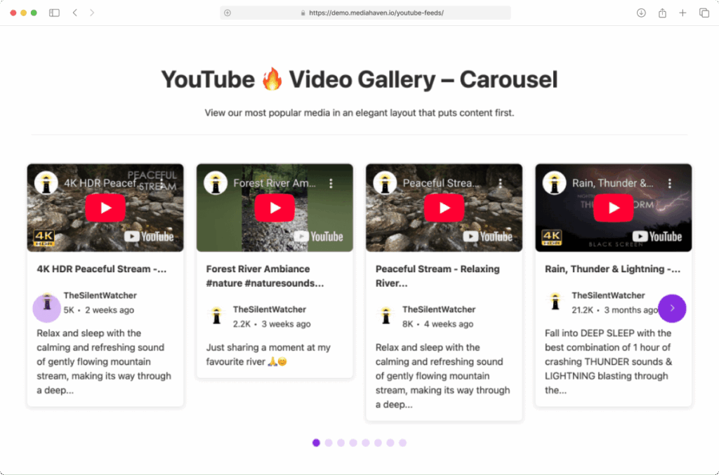
screenshot-11 shows a YouTube video carousel — the same Carousel layout applied to a YouTube channel feed. The visual is identical, but the data source is live from YouTube.
Carousel configuration in MediaHaven:
Go to Views → Add New → Layout: Carousel.
Slides to show — how many video cards are visible simultaneously per breakpoint. Common settings:
- Mobile: 1 slide
- Tablet: 2 slides
- Desktop: 3–4 slides
Carousel navigation:
- Navigation arrows — left/right arrows (← →) appear on the carousel sides. Toggle on/off. Style their color, background, shape, and hover state in the Style tab.
- Pagination dots — small indicator dots below the carousel showing current position. Toggle on/off. Style their size, color, and active color.
Both navigation elements have their own style controls so they integrate naturally with your site’s design rather than looking like generic plugin UI.
Auto-play: Set the carousel to advance automatically on a timer. Configure the transition speed and pause-on-hover behavior.
Loop: Enable infinite loop so the carousel cycles continuously rather than stopping at the last slide.
Swipe/touch support: Always on — mobile users swipe naturally through carousel items.
3. Multi-row Carousel Layout
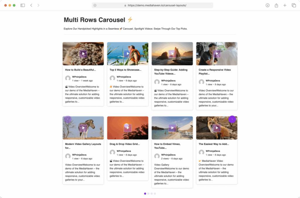
The Multi-row Carousel is a hybrid — it shows multiple rows of video cards in a single horizontal slider. Think of it as a grid that slides sideways.
Best for:
- Showing many videos in a compact horizontal space
- Category showcase sections (e.g., “Browse Our Course Library”)
- Magazine-style homepage sections with featured content
- YouTube channel previews with enough videos to fill 2–3 rows
What it looks like: screenshot-7 shows the Multi-row Carousel with two rows of video cards visible simultaneously, the whole group sliding horizontally when navigated. screenshot-12 shows this applied to YouTube feeds.
Multi-row Carousel configuration:
Go to Views → Add New → Layout: Multi-row Carousel.
Rows — set how many rows of video cards appear simultaneously (typically 2–3).
Slides per group — how many cards advance per navigation click. Set this to match your visible columns so navigation feels natural.
All other carousel settings (navigation, dots, auto-play, loop, touch) apply identically.
Card Design: Controlling What Appears on Each Video Card
Regardless of which layout you choose, every video card in MediaHaven has the same set of toggleable elements. These are configured in the Display Options tab of your View editor.
Thumbnail / Poster Image
The visual heart of every card. MediaHaven handles these with:
Lazy loading — thumbnails use native browser lazy loading and MediaHaven’s own lazy-load engine. Images only load when they scroll into the viewport, keeping initial page load fast.
Image quality control — choose from multiple compression levels. Higher quality = sharper images but more data. Lower quality = faster load but slightly softer images. For most sites, the medium quality setting is ideal.
Image crop options:
- Soft crop (default) — scales the image proportionally to fit, no content is cut off
- Hard crop — crops the image to an exact ratio, ensuring uniformly sized cards regardless of original thumbnail dimensions. Best for visual consistency in grids.
Custom thumbnail size (Pro) — define exact pixel dimensions for thumbnails.
WebP conversion (Pro) — automatically converts thumbnails to WebP format, reducing file size by 25–35% without visible quality loss.
Poster show/hide — toggle whether the thumbnail shows at all (useful for minimal embed-only designs).
Video Title
Show or hide the video title on cards. When visible, you can control:
- Font size
- Font weight (regular vs. bold)
- Title color and hover color
- Maximum title length (character limit with ellipsis)
Author Information
Toggle author name and avatar display. When enabled, shows the video’s WordPress author name and their avatar image (pulled from Gravatar or their WordPress profile). Useful for multi-author channels or team video libraries. Hide for solo creator sites.
Engagement Meta
- View count — MediaHaven’s own site-level view counter. Updates via AJAX (no page reload) when a visitor watches a video. Displays as “96 views.”
- Like/dislike thumbs — visitors can give a thumbs up or thumbs down. Data stored in your WordPress database. Encourages engagement without relying on YouTube’s systems.
- Publish date — shows as absolute date or relative time (“8 months ago”). Toggle on for news/recent content, off for evergreen libraries.
- Comment count — shows WordPress comment count for each video post.
- Category labels — displays which categories the video belongs to, as clickable links to category archive pages.
- Tag labels — same as categories but for tags.
Description Excerpt
Shows a text preview below the thumbnail and meta. Configure excerpt length in characters. Good for video libraries where users need context to decide which video to watch. Disable for clean visual-focused galleries.
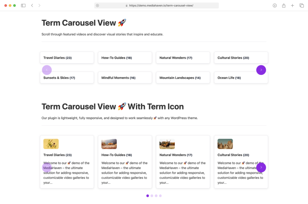
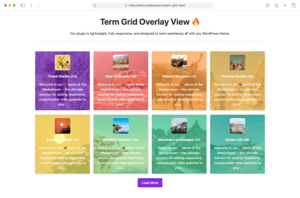
The Term Layout: Visual Category Navigation
Beyond individual video cards, MediaHaven includes a separate layout system for displaying your video categories and tags as visual navigation elements. This is called the Term layout.
What it is: Instead of a plain dropdown or text list, your video categories appear as visual cards — with icons, background images, hover effects, and click-through to the category archive page.
screenshot-15 shows categories displayed with icons — each category has its own Font Awesome icon and title, arranged in a clean grid. This makes it immediately scannable: visitors can see “Fitness Videos,” “Cooking Tutorials,” and “Product Reviews” as distinct visual blocks and click into the one they want.
screenshot-14 shows the overlay style variant — categories displayed as cards with a background image and overlaid text. This gives a rich visual navigation that works for any site type.
screenshot-16 shows the standard term display — a simple, clean list-style presentation of categories.
Term layout configuration:
Go to Views → Add New → Feed Source: Taxonomy.
Then choose your layout:
- Term Grid — categories in a responsive column grid
- Term Carousel — categories in a horizontal slider
- Term Multi-row Carousel — categories in a multi-row sliding layout
Per-term settings:
- Upload a background image for each category
- Add a Font Awesome icon
- Set term-specific colors (background, hover background, title color, hover title color)
- Configure borders and border radius
Load More for Terms: If you have many categories, enable Term Ajax Load More or Infinite Scroll to progressively load them.
Global Styles vs. Per-Shortcode Styles
MediaHaven has a two-tier styling system:
Global Styles (MediaHaven Lite → Global Styles): Set default values for typography, colors, and spacing that apply to all galleries unless overridden.
Per-Shortcode Styles (Style tab in the View editor): Override specific settings for an individual gallery. These take priority over Global Styles for that shortcode only.
Practical workflow: Set your site’s brand colors and fonts in Global Styles. Then use per-shortcode overrides only when a specific gallery needs to look different — a dark-background featured section, a compact sidebar carousel, etc.
This prevents you from having to manually re-configure styling every time you create a new gallery.
Custom CSS for Advanced Styling
Every MediaHaven gallery has a unique CSS selector based on its shortcode ID. This means you can write targeted CSS that only affects one specific gallery without touching any others.
Go to MediaHaven Lite → Settings → Custom CSS to add your CSS. MediaHaven loads this alongside the plugin’s own styles.
Example — adding a hover border to a specific grid’s cards:
css
#wpnd-mhpro-container-160 .wpnd-mhpro-post-item:hover {
  border: 2px solid #e63946;
  transform: translateY(-2px);
  transition: all 0.2s ease;
}
Replace 5 with your actual View ID. This kind of targeted override is particularly useful for landing pages or homepage sections where you want a specific branded look without affecting gallery pages elsewhere.
Responsive Behavior: What Actually Happens on Mobile
MediaHaven’s responsive system is built on a proper 5-breakpoint grid (XS, SM, MD, LG, XL). Here’s what this means in practice:
Grid layouts collapse gracefully. A 3-column desktop grid becomes 2 columns on tablet and 1 column on mobile. Thumbnails resize proportionally. Text truncates at your configured excerpt length.
Carousel layouts adjust the number of visible slides. A 3-up carousel on desktop shows 2 on tablet and 1 on mobile. Navigation arrows resize. Touch swipe is always available on mobile regardless of arrow visibility.
Term grids and carousels follow the same breakpoint logic as regular layouts.
MediaHaven also respects the extra-small (XS) breakpoint for very small devices and the extra-large (XL) breakpoint for wide monitors — making it genuinely responsive across the full modern device range, not just a basic 3-breakpoint mobile/tablet/desktop system.
Live Preview: Design Before You Publish
The most underappreciated feature for layout work is the Shortcode Live Preview in the View editor. Every change you make to layout, columns, card display options, or styling immediately reflects in the preview panel — without saving, without loading a frontend page.
This is the right way to design your gallery:
- Make a layout choice
- See it in the preview
- Adjust column counts until it looks right
- Toggle display elements on/off and check the result
- Refine styles until it matches your design
- Save and embed — confident it looks right
Demo Gallery Links
Before building your own, browse the official MediaHaven demos to see the layouts in action:
- Grid layouts: demo.mediahaven.io
- Carousel layouts: demo.mediahaven.io/carousel-layouts/
- YouTube feeds: demo.mediahaven.io/youtube-feeds/
- Term/category grid: demo.mediahaven.io/term-grid-view/
- Term carousel: demo.mediahaven.io/term-carousel-view/
- Ajax Live Filter (Pro): demo.mediahaven.io/ajax-live-filters/
Pro Layout Features Worth Knowing
When you’re ready to go beyond what Lite offers:
Drag & Drop Video Card Builder (Pro) — reorder the sections of each video card (media, title, meta, description) using drag-and-drop in the Visual Order tab. No code. Change the order for any layout.
Custom Player Styles (Pro) — style your video player’s control bar, volume slider, progress bar, and play button to match your brand. Shown in screenshot-8.
Ajax Live Filter (Pro) — add a real-time filter sidebar or top bar above any grid layout. Visitors filter videos by category, tag, duration, resolution, featured status, and more — without a page reload.
Terms Overlay Style (Pro) — shown in screenshot-14, the overlay category cards with full image backgrounds and gradient text overlays. Unavailable in Lite.
All Pro features start at $79/year for one site at mediahaven.io/pricing. 14-day money-back guarantee.
Summary
MediaHaven’s Grid, Carousel, and Multi-row Carousel layouts cover the full range of video gallery use cases — from simple archives to featured homepage sections to visual category navigation. Each layout is responsive across five breakpoints, deeply configurable through the admin UI, and previewable in real time before you publish.
👉 Download MediaHaven Lite 👉 View all live layout demos 👉 Unlock Pro layout features
Drop a comment below if you have questions about layout configuration for your specific use case.